Reach me at:
andrewshpachuk@gmail.com
↗
@lingvo838
↗
↗
Contact
About
IGMA – a remote-play casino platform.
Casino platform where users control a physical robot at a real table over a live video stream — designed across web, tablet, and mobile.
Role
Product Designer
Client
IGMA (via AWAKE Agency)
Year
2026
Timeline
~3 months
Scope
Onboarding, account cabinet, roulette game flow, poker game flow, homepage · Web + tablet + mobile
Markets
Live
Tools
Figma

Overview
IGMA is a remote-play casino platform with an unusual premise: instead of playing against a simulated game, the user controls a physical robot arm operating at a real table in a real venue. A live video feed streams the table — dealer, cards, chips, roulette wheel — to the user's device. The user's actions in the interface (place a chip, fold, deal) are executed by the robot in the physical room, in real time.
The product covers three modes: Roulette, Poker, and Observer (watch and bet without playing directly).
I was brought onto the project by AWAKE Agency for a three-month engagement covering the full user-facing product: sign-in and sign-up flows including two-factor authentication, the full account cabinet (profile, payments, notifications, statistics, device management, KYC scaffold, support), both game flows across roulette and poker, and the homepage. Everything was designed for three breakpoints — desktop, tablet, and mobile — and shipped to production.

The core design challenge
Most casino platforms are digital top to bottom — the "table" is a rendered graphic, the "dealer" is a state machine, the "chips" are database entries. IGMA is different.
Everything on the screen is a physical object being filmed live. That fundamentally changes what interface design has to do.
Three constraints shaped every decision:
The video is the product. The user has to see the dealer, the chips, the wheel, and the robot arm at all times. Any interface I designed would sit on top of live video — as an overlay, not as a container. UI elements had to be legible against unpredictable, moving backgrounds without covering the parts of the frame the user needs to see.
Actions have physical latency. When the user places a chip, the robot picks up a real chip and places it on a real table. That takes a moment — and that moment has to feel intentional, not like the app is broken. Every action needed clear system feedback and honest timing.
One "game state" lives across two places. The interface has to match the physical table exactly at every moment: what's on the felt, whose turn it is, how much time is left before the wheel spins. If the video and the UI disagree — even for half a second — trust breaks. The design had to treat the physical table and the digital overlay as one system, not two.
I never worked directly with the robot engineers, but the client-side team walked me through how the robots operate — what they can and can't do, how long each action takes, what the video feed shows and when. Every interface decision was scoped against those constraints from the start.
Sign in and sign up
The auth flow had to reconcile two things at once: the atmosphere of the product (dark, cinematic, high-drama editorial imagery) and the reality that the user was about to put real money into a regulated financial environment. Both mattered. Get the atmosphere right and the product feels like the real thing. Get the security right and the user actually trusts it.

The structure split by auth method (email vs Google) and by 2FA state (enabled vs not), giving four combinations for sign-in and five for sign-up. Every step was designed for the same visual system — full-bleed dramatic image on the left half, form on the right, consistent typography and rhythm across all combinations. The 2FA layer is optional at signup but supported from day one — Google Authenticator flow with QR code, backup codes screen, and recovery path if the user loses their device.
I made the deliberate call to keep every screen edge-to-edge with the same background image — no framed cards, no floating modals mid-flow. The atmosphere carries through the entire onboarding, which is how the product introduces itself.
The account cabinet
The cabinet is where the platform behaves less like a casino and more like a financial product. Users are handling money, verifying identity, managing devices, tracking their activity, and contacting support. It had to feel dense, trustworthy, and calm — the opposite of the game surface.
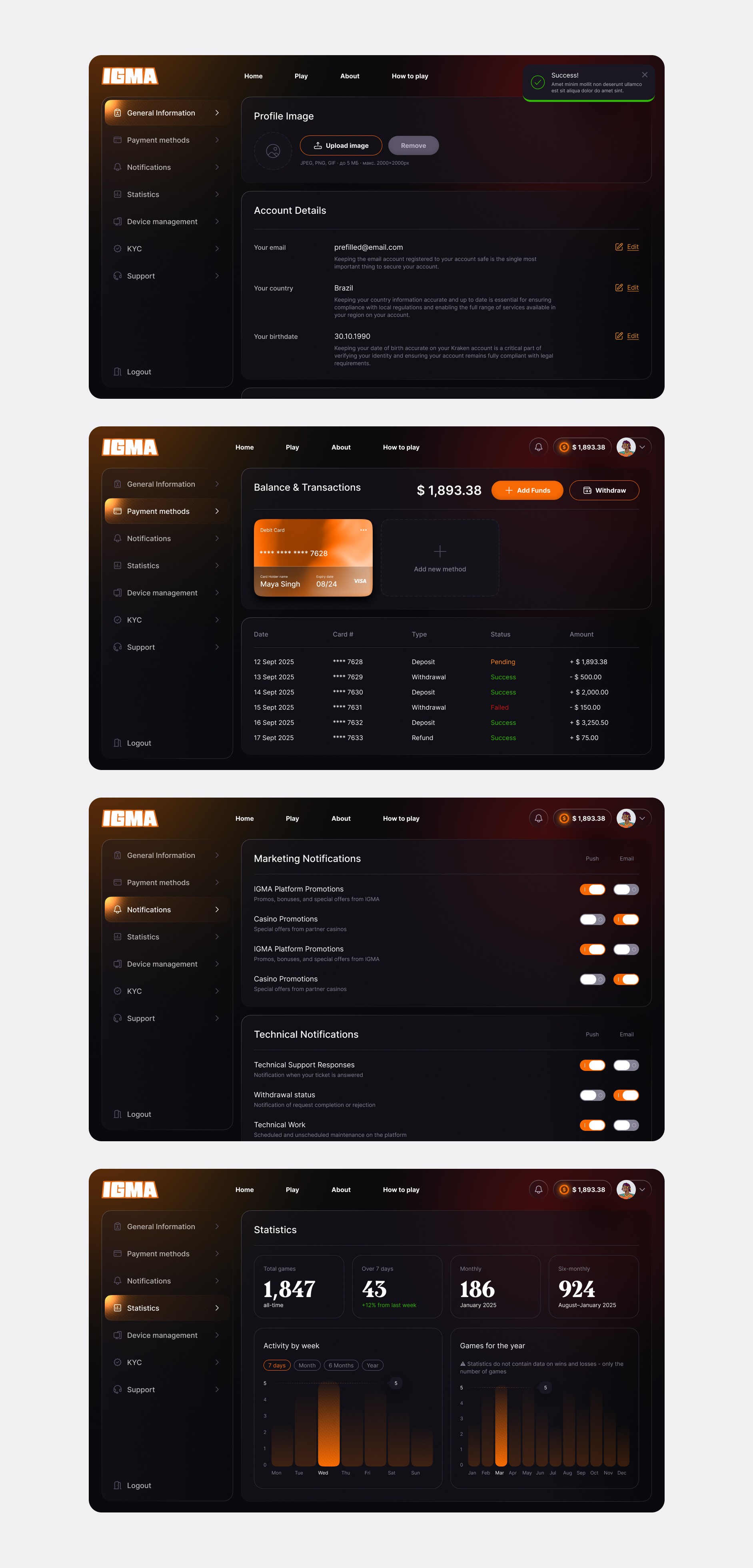
The cabinet runs on the same left-nav pattern users see across serious fintech products (Wise, Revolut, N26). Sections cover:
— General Information — profile image, email, country, date of birth, with inline edit modals for the sensitive fields (each with 2FA confirmation where needed).
— Payment Methods — cards on file, transaction history with typed rows (deposit / withdrawal / refund) and clear status tags.
— Notifications — separate control matrices for marketing and technical notifications, each with push/email toggles per event type. Regulatory reality: users must be able to opt out of marketing without losing critical account alerts.
— Statistics — total games played, wins over the past 7 days, monthly view, six-monthly view, with activity charts by week and by year.
— Device Management — active sessions with the ability to terminate individually or all at once. Critical for a money-handling product.
— KYC — scaffolded but not fully designed during this engagement (still in legal review at the time).
— Support — ticket-based system with statuses (Waiting for respond / Answered / Closed / Archived) and threaded conversation view for open tickets.
The 2FA setup and 2FA disable flows are their own separate mini-flows inside General Information. Turning 2FA off deliberately has more friction than turning it on — a confirmation modal explaining the security trade-off, plus a re-authentication step.
Making the safer action easier than the unsafe one is a small pattern that quietly compounds across the product.

The homepage
The homepage does one thing: help the user pick which mode to play. Three cards, three products, three visual identities under a shared frame.

Each card carries its own atmospheric hero image and copy that names the physical premise explicitly: "Remotely control a Poker-Robot from your home, work, or on the go and beat the dealer." The framing is intentional. Every other online casino sells you "play." IGMA sells you remote control of a real game. Making that the promise on the front door aligned the whole product with what actually makes it different.
Roulette — the flow
The roulette experience is the clearest expression of the video-first UI paradigm.

The flow: user picks a table from the catalog → the table loads → a "waiting" state bridges the gap while the current round finishes → then the betting interface materialises over the live video with a clear countdown.

Several interface decisions worth calling out:
The betting grid is the interface, not a menu. Instead of a separate "place bet" panel, the roulette numbers grid sits at the bottom of the frame in a semi-transparent overlay. Users tap directly on the grid — 1 through 36, columns, dozens, red/black, even/odd, plus the neighbours groups (Tiers, Orphelins, Voisins, Zero) — exactly how they would on a physical table. The overlay is dark enough to be readable, transparent enough to see the dealer's hands behind it.
Chip denominations sit above the grid — $1, $5, $10, $15, $25, $50, $100 — as a horizontal chip row. Tap a chip to select the denomination, then tap the grid to place. The interaction mirrors physical casino behaviour, which reduces the learning curve to zero for anyone who's played before.
Two floating action buttons anchor the screen corners. Red CLEAN on the left to wipe bets, green BET on the right to confirm. The glossy pill styling makes them feel like physical chips themselves — a small piece of visual language that ties the interface to the physical premise. Both buttons sit at the corners specifically because that's where the video frame is least informative, and where the user's thumb rests naturally on mobile.
The countdown is the central status element.
"Делайте ваши ставки" ("Place your bets") with a bar underneath and a numeric remaining-seconds counter. This is the single most important information on the screen at any moment — miss the window, no bet — so it lives dead centre.
The history strip runs along the bottom. Recent winning numbers (12 · 23 · 11 · 5 · 7 · 6 · 11 · 7) — critical context in roulette even though mathematically each spin is independent. Players want it. The strip stays visible without eating important screen real estate.
Session metadata sits top-left — session ID, day, precise timestamp — because in a real-money regulated product, users need to be able to reference specific moments if something goes wrong. Balance sits top-right, where it's glanceable without being loud.
Nothing in this overlay was a default choice. Every element is placed exactly where the video needs it to be not placed — corners, edges, transparent zones — so the physical action stays the star.
Poker — the flow
Poker is a different beast. Multi-round, multi-player, multi-decision, with hidden information (your cards, not shown to opponents). The video shows the physical table; the interface shows what only you can see.

Before entering a table, the user goes through a small pre-game flow: pick a table from the catalog, filter by availability and stakes if needed, configure participation mode (Play — you control the robot; Watch and Bet — observer mode with side-betting), and set your buy-in and ante range. Then, on mobile, a device-rotation prompt asks the user to switch to landscape — because a poker table with all seats visible only works horizontally.

The game surface follows the roulette pattern of "UI as overlay on live video" but with a different vocabulary. Circular chip-styled action buttons — FOLD (red), CHECK / ANTE / BET (green/orange) — float over the video at the bottom, positioned where the player's hands would sit at a physical table. Only the current-player's actions are highlighted; others are dimmed. Chip denominations for bet sizing follow the same row pattern as roulette, keeping the two products visually consistent.
Hidden information is treated with care. Your cards are visible only to you, rendered in a private overlay that never appears in any recording or observer view. This isn't a design flourish — it's a hard product constraint. In observer mode, spectators see everything the table shows publicly but never any private information belonging to active players. The interface enforces this at the visual level, not just the backend.
Adapting across three breakpoints
Every flow was designed for desktop, tablet, and mobile — not as three separate designs, but as one flow that adapts.

On desktop, the video occupies the full frame with the overlay tucked into the corners and bottom edge. On tablet, the overlay compresses — the betting grid tightens, the chip row shrinks, but the video still fills the frame edge-to-edge. On mobile in landscape, the interface goes to its most compact form: the betting grid pushes to the very bottom, action buttons anchor at the extreme corners, and the countdown moves to a slim bar across the top.
Mobile portrait is a special case — for the game surfaces, the app actively prompts the user to rotate. A live table simply doesn't work portrait. Fighting the physics of the format would have made the product worse; asking the user to rotate for 5 seconds makes it better.
The cabinet, homepage, and auth all use standard responsive patterns and adapt cleanly. The game surfaces are where the adaptation work was hardest — and where I spent the most time getting the overlay to feel intentional at every size.
Outcome
The full engagement shipped to production. Sign-in and sign-up, the entire cabinet, both game flows for roulette and poker, and the homepage — all live in the product, all adapted across three breakpoints. The platform is currently operating in Romania and Bulgaria as its primary markets.
I don't have direct post-launch metrics from the engagement — the client-side team owned analytics. What I can say is the design shipped in full without a redesign, the product went from private testing to public operation on schedule, and the visual system I built is what users see today.
Reflections
This was one of the most technically constrained projects I've worked on, and it made me sharper for it. When you can't move the video, can't rush the robot, can't hide the physical world behind polish — the design gets stripped down to the essentials. Where does the eye need to go. What information is truly critical. What can be a corner element. What can be a peripheral cue. Working with a real physical system in the loop forces those questions in ways a purely digital product doesn't.
If I were doing the engagement again, I'd push earlier to visit the physical rooms where the robots operate. I designed the entire product based on how the team described the physical setup — which was accurate, but there's a version of my thinking that would have been sharper if I'd actually spent a day watching the robot play, watching the dealer, watching the way light hits the felt. For a product this specific, being on-site would have been an unfair advantage.
© 2026. Made by Andrew Sh