Reach me at:
andrewshpachuk@gmail.com
↗
@lingvo838
↗
↗
Contact
About
ISINA Music – Mobile Platform for artists
Six months of product design work on a live mobile platform connecting emerging musicians with the music industry.
Role
Product Designer
Client
ISINA Music (direct contract)
Year
2025
Platform
iOS + Android · Mobile
Timeline
~6 month
Scope
Onboarding, premium flow, design system, artist profile, player, charts
Tools
Figma, Figma variables

Overview
ISINA Music is a mobile platform built around a simple promise: connect emerging artists with the music industry — labels, producers, A&R reps — through expert reviews, charts, premium opportunities, and a profile that shows what an artist can do. The product had been live for years with an established user base when I came in.
I joined as the sole designer on a six-month contract through a personal referral. The work was ongoing and broad: improving what was already there, redesigning what wasn't working, and laying the groundwork for the next phase of the product. Across the engagement I redesigned the onboarding flow, rebuilt the premium subscription experience, restructured the artist profile, refreshed the player and charts screen, and consolidated the visual layer into a proper Figma variables–based design system.
Towards the end of the engagement, the team began a much larger initiative — restructuring registration around distinct user roles — which I prototyped through to four parallel sets but didn't ship before the project transitioned to a different team.

The starting point
ISINA wasn't a redesign-from-scratch project. It was a mature product with real users, real revenue, and real legacy decisions baked into every screen. That changes how design works. You don't get to throw things away. You inherit, you respect, and you improve where the impact is highest.
When I came in, several patterns surfaced quickly across screens and flows:
— The onboarding flow was outdated, inconsistent, and longer than it needed to be
— a mix of patterns layered on each other over years.
— The premium subscription page was confusing: dense text-heavy layouts, weak visual hierarchy, and offers that didn't communicate value well.
— The Figma source was a mess of disconnected styles and one-off components — no single source of truth, no variables, hard to maintain.
— The artist profile lacked structure: blocks weren't grouped, hierarchy was flat, and key information was buried.
— Smaller pieces — the player, the charts, modal flows — had drifted visually over time.
The brief from the product manager was loose by design. He'd describe the problem and the goal, and the solution was mine to shape and propose. That autonomy ran through the entire engagement.

Working on a live product
A few principles shaped how I approached every change:
Respect what works. ISINA's users were used to the product. Wholesale redesigns would have been disruptive without proportionate gain. I focused on solving real friction, not refreshing for the sake of it.
Earn each change with a reason. Every screen I touched had a specific problem behind it — completion drop-off, conversion friction, support tickets, PM observations from analytics. Decisions traced back to the problem, not to design preference.
Build the system as you go. Instead of treating the design system as a separate parallel track, I rebuilt it inside the work — every screen I redesigned contributed cleaned components, proper variables, and structure that the next screen would inherit. By the end of the engagement, the source file looked nothing like what I'd inherited.
Onboarding — redesigning the registration flow
The original Get Started flow had grown messy over the years: inconsistent layouts across steps, redundant screens, weak hierarchy on auth choices, and unnecessary friction around email confirmation and code entry.

I redesigned the flow around a pattern that's become standard in mobile onboarding for a reason: a single primary visual entry point, social auth presented as equal options, and a passwordless email + code mechanic that's faster, more secure, and removes the password-creation friction.

The key changes:
— One visual hero screen instead of a generic form-and-buttons layout. The brand image carries the emotional opening; the auth options follow underneath without competing for attention.
— Continue with email/Apple/Google/Facebook as equal first-class actions. The previous version treated email as primary and socials as secondary, even though most users on a music platform expect social-first sign-in.
— Passwordless code mechanic. The user receives a code by email, pastes or enters it, and is in. No password creation, no password recovery flows, no abandoned signups because someone forgot to check their inbox.
— Visual continuity across steps. The same hero image carries through the auth modal and the code-entry screen, anchoring the user in the same context throughout the flow.
Steps got shorter, messages got clearer, and the flow stopped feeling like a form.

The design system — from chaos to structure
This was the longest-running thread of the engagement. The Figma source I inherited was a sprawl: duplicated colors, hardcoded values, components built one-off for specific screens, no shared scale for typography or spacing. Every new screen I designed required either reusing something inconsistent or making the inconsistency worse.
I rebuilt it from inside the project, screen by screen. By the end:
— Variables across color, typography, spacing, radius, and elevation. Five layers of tokens, all wired into the components.
— A proper component library — buttons, inputs, modals, list rows, cards, sheets, chips, navigation, status states — every one with proper variants for state, size, and content.
— A single source of truth. Every screen in the project now references the system, not local overrides.
This wasn't a deliverable I was hired for — it was something I built into the work because the project couldn't scale without it. The team noticed. By the end, new feature design was 2–3x faster than at the start because there was finally a system to compose with.


Premium subscription — redesigning the offer
The original premium offer page was the place users hit when they tried to do something the free tier didn't support. It needed to convert. It wasn't built to.

The problems with the original:
— Visual hierarchy was inverted. The cheapest visual element (the price) was the loudest. The reason to upgrade — the actual benefits — was a sideways-scrolling row of stylized but unreadable cards. — The benefits weren't legible. "UPLOAD UNLIMI TED TRACKS" was visually broken across lines. The user had to do work to understand what they were getting.
— One screen tried to do everything. Generic "get premium" without acknowledging why the user landed there in the first place.
I redesigned the offer around three principles:
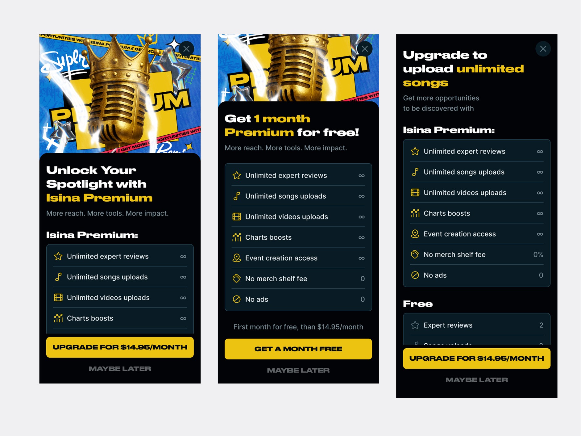
— Contextual entry points. When a user hits the limit on song uploads, they see "Upgrade to upload unlimited songs." When they try to create an event, they see "Upgrade to create unlimited events, free for month." Same product, different doors — each tuned to the moment of friction.
— A clear, scannable benefits list. Stars, music, video, charts, events, no merch fee, no ads — each with a visible cap or unlimited indicator. The user sees exactly what they get without parsing marketing copy.
— Free vs premium contrast on the same screen. Below the premium block, a "Free" comparison anchors the value differential without forcing the user to navigate elsewhere to compare.
The flow also got proper edge cases: subscription management, payment failure, processing states, "you'll lose access" warnings, lifetime award screens for original users — every state the original product handled poorly or not at all.

Smaller systemic improvements
Across the engagement, several other parts of the product got rebuilt:
Artist profile. I added new content blocks where they were needed (live performances, services, references) and restructured the existing layout for clearer hierarchy. The profile now reads like a portfolio, not a settings page.
Charts and home screen. Restructured the discovery surface so the chart positions, artist cards, and entry points to artist pages have clear visual priority. New card patterns made the list scannable rather than uniform.
Player. A focused refresh — typography, controls, spacing, state visuals. Same functionality, cleaner read.


The big initiative — role-based registration
Towards the end of the engagement, we started a much larger piece of work: redesigning registration so that users could declare their role on the platform from day one — Artist, Industry Pro, Band, Organization, or Listener — and get a tailored onboarding from there.
Why this mattered. ISINA's user base wasn't homogeneous. A vocalist signing up to share music has fundamentally different needs from a music label rep looking to scout talent — or a fan who just wants to follow artists. The original "one flow fits all" approach forced everyone through the same set of steps and asked for information that didn't always apply. The product was full of features that some users needed and others would never touch — and there was no signal at signup to tell them apart.
The PM led the user research and role definition (the system shaped up to five core roles, each with different feature surfaces — different profile blocks, different filters, different home experiences). I designed the onboarding paths for all of them.

Four parallel prototype sets. I built out complete onboarding flows for each role, designed to share a structural backbone but diverge meaningfully where the user's needs did. An artist's flow includes specialization (vocalist, instrumentalist, producer), genre, a profile photo. An industry pro's flow asks about role and specialization in a different shape — A&R, manager, lawyer, publisher. A listener's flow is the shortest path to "you're in" because that's all they need.
Feedback came from real users. We collected feedback directly from musicians on the platform — not formal interviews, but ongoing collection through the team's existing channels with active users. That feedback shaped what each role's flow asked for and where to cut steps that felt like friction.
The work didn't ship. The project transitioned to a different team before the role-based flow rolled out — a shift on the client side rather than anything tied to the design itself. The prototypes, research, and frameworks were handed over.
This is one of the parts of design work that's worth being honest about. Not every piece of design ships. Sometimes the project changes hands, the priorities shift, the company restructures. What matters is what was learned and what was left behind for whoever picks it up.

Outcome
Across six months on a live product:
— Onboarding flow shipped. New Get Started experience, new code-based auth, faster path from app open to logged-in user.
— Premium offer redesigned and shipped. Contextual entry points, clear benefits, proper subscription management states. — Design system rebuilt. Variables, components, and structure that the team continues to use and extend.
— Artist profile, charts, player, home screen — all redesigned and shipped with the new system.
— Role-based onboarding — designed to four prototype sets, handed off when the project transitioned to a different team.
I don't have access to post-launch metrics from the contract — that's a limitation worth naming. What I can say is the work shipped to a live product with an established user base, the PM and team approved every design that went into production, and the design system I built continues to be the foundation for further work on the product.
You can see the live product on App Store and Google Play — searching "ISINA Music."
Reflections
This was the first contract I've taken on a live product at this scale, and the experience reframed how I think about design work. Three things stuck:
The Figma file is a product too. The state of a project's source files — variables, components, naming, structure — is a real deliverable, not a side effect. A clean source isn't pedantry. It's the difference between the next designer being productive on day one or spending two weeks just figuring out what's where.
Constraints sharpen design. Working inside a live product with real users teaches a kind of restraint that greenfield projects don't. Every decision has to clear a bar: does this actually solve a real problem, or am I just enjoying the redesign? Most of the time, the answer is to do less and do it more carefully.
Not everything ships, and that's okay. The role-based onboarding work was some of the strongest design I did on this project, and it didn't go live — at least not under my hand. Six months in, I'm comfortable with that. The work existed. It was good. Someone else gets to ship it. The craft was real either way.
© 2026. Made by Andrew Sh