Reach me at:
andrewshpachuk@gmail.com
↗
@lingvo838
↗
↗
Contact
About
LoveDiet Challenge – Mobile App UI/UX
A mobile product where two people lose weight together — one diets, the other holds them to it — built around a signed agreement, daily check-ins and rewards they promise each other.
Role
Product Designer
Client
LoveDiet Challenge (direct contract)
Year
2026
Scope
Two user roles · Onboarding, paywall, Agreement, Dashboard, Progress, Messenger, Settings
Tools
Figma

Overview
Most diet apps are built for one person and a calorie counter. LoveDiet Challenge starts from a different premise: people stick to a diet when someone else is watching — and when there's something to win.
The product pairs two users. The Dieter is the person losing weight. The PT — a partner, friend or personal trainer — keeps them accountable. Before anything else happens, the two sign an Agreement: the target weight, the deadline, the daily routine, and the rewards each of them promises the other.
From there, the Dieter logs every meal, workout and weigh-in, rates how they behaved, and sends it to the PT for feedback. On weekly and final weighing days, the app checks the target and — if it's hit — triggers the reward written into the Agreement.
I was the sole designer on the product. I worked directly with the founder, who owned the concept and the brand — the red palette, the heart mascot and the onboarding illustrations were fixed inputs. My job was everything around them: the information architecture, both roles' flows, every state and edge case, and the component library the screens were built from.

The core design challenge
A single-player diet app has one person, one goal and one screen of data. LoveDiet has two people, one shared goal, and a contract between them. That changes what the interface has to do.
Three constraints shaped every decision:
Nothing works until two people agree. The Agreement is the gate to the whole product. Until both sides have signed, the Dashboard, Progress and Messenger have nothing to show. Every screen needed a meaningful state for "not connected yet" — not a blank page.
The same data means different things to each role. A logged breakfast is a confession for the Dieter and a coaching moment for the PT. The two roles share most of the data but need different actions on it.
Motivation lives in moments, not dashboards. People don't quit a diet because a chart is hard to read. They quit on a bad week. The product had to make the weekly check-in and the reward feel like an event — and make a missed target feel recoverable, not like failure.

Two roles, one goal
I designed the product as one app with two lenses rather than two apps. Both roles share the same navigation — Dashboard, Agreement, Progress, Messenger — so either person can glance at the partner's screen and understand it instantly.
The difference is in what each role can do:
— The Dieter logs. Meals, exercise, weight, a photo, a mood rating and a message to the PT. Their Dashboard is a to-do list for the day.
— The PT reviews. They see the same Daily Log, open any entry for full detail, and respond in the Messenger. Their notifications are built around one call to action: your partner logged something — give feedback.
— Both see the same Progress and the same rewards. The shared view matters: the reward isn't something the app gives — it's something one person promised the other, and both can see whether it was earned.
Keeping the shell identical also kept the system lean. Most components serve both roles; only the actions on top of them change.
The Agreement — the heart of the product
The Agreement is where the Dieter and the PT set the diet's objectives together. It's the most important flow in the app and the longest — around ten steps — so the work was making it feel like a commitment, not paperwork.
The flow walks through:
01 — Choose your role. Dieter or PT. The role is picked here, not at sign-up, so anyone can install the app first.
02 — Pick your partner. Type a phone number manually or select from contacts.
03 — About the Dieter. Height, daily activity level.
04 — Diet targets. Initial weight, target weight and time period, with a ruler-style weight picker.
05 — Difficulty level. A gauge that reacts to the targets — losing 10 kg in two weeks lands in the red zone before the user commits to it.
06 — Initial photo. The "before" shot that later powers the Photo Tracker.
07 — Meal schedule. Times for breakfast, snacks, lunch and dinner — these drive the reminders later.
08 — PT → Dieter reward and Dieter → PT reward. What each person promises the other when a target is hit. Each step has a "Need help?" explainer, because writing a reward from scratch is where people stall.
09 — Review and send. The full Agreement rendered as a single document with both names, a personal message, and explicit consent to share logs and photos with the partner.
The flow has three entry points that converge on the same screens: manual entry, selecting from contacts, and accepting an invitation someone else sent. The invited partner sees the proposal, can accept or decline, and can edit before signing — edits send it back to the other side as a negotiation. Edit Agreement and Delete Agreement reuse the same steps instead of introducing a separate settings form.

Daily Log — honest by design
The Dashboard opens on today's Daily Log, split into three tabs: Meals, Exercise and Weight. Each planned meal from the Agreement appears as a row with its time and a Log button. A logged entry shows the photo, the meal tag and a small mood badge.
Logging a meal asks for four things: a photo, a short description, a message to the PT — and How did you behave?, a five-point scale from Very Good to Bad.
That last question is the most important design decision in the flow. Calorie counting is precise but exhausting, and people lie to it. A self-rating is fast, honest and gives the PT something to respond to. It also feeds the Behavior Tracker later, so a week of "Not Good" lunches becomes a visible pattern, not a guilty memory.
Two smaller details:
— Consent on every share. Before a log goes to the PT, the Dieter confirms they agree to share it — with a "don't ask again" option so it's a one-time decision, not daily friction.
— Logs stay editable. Meal, exercise and weight details all have edit and delete paths with confirmation, so a wrong entry never pollutes the Progress data.


Weighing days and rewards
Weighing is where the product's promise is either kept or broken, so I mapped it as a decision tree before drawing any screens:
— Is today a weekly weighing day? If not, logging weight is a quiet daily entry.
— If it is, the Dashboard shows a banner the moment the app opens: It's a Weekly Weighing Day — don't forget to log your weight.
— After logging, the app compares the result to the week's target. Hit it — a full-screen celebration, then the PT → Dieter reward card quoting the exact reward text from the Agreement.
— Missed it — Oops! Weekly Target Not Achieved, with start and target weights side by side and one line of encouragement. No red, no punishment, a single Continue.
— On the final weighing day, the same tree runs against the final target and unlocks both rewards — including the Dieter → PT reward, the Dieter's thank-you to the partner who held them to it.
I also designed the cases that break the happy path: weight drifting back close to the starting point, and deleting a log that already counted toward a target.
The reward screens are deliberately loud — full red, trophy, confetti. Everything else in the app stays calm so these moments land.

Progress, Messenger and Settings
Progress is four tabs, each answering one question:
— Weight — Am I on track? A chart of actual weight against the ideal line from start to goal, a 1 Week / All Time toggle, and a grid of the numbers people actually ask about: current weight, kilos lost, kilos still missing, % achieved, time to target.
— Photos — Can I see it? A before/after slider comparing the Agreement photo with the latest one, navigable by date.
— Behavior — Where do I slip? Every meal and workout's mood rating laid out as a week grid, Meals and Exercise on a toggle. Patterns jump out — like every afternoon snack being "Okay" at best.
— Rewards — What have we earned? Weekly rewards as cards with target vs achieved weight and an Achieved / Not Achieved trophy, split by direction (Dieter → PT, PT → Dieter).
Messenger is a single shared chat between the two partners and the LoveDiet mascot. Logs shared from the Dashboard arrive as rich cards, and people can send photos and files, with read receipts and a full-screen image viewer.
Settings carry the product's routine: notification toggles per event type (weight logs, agreement changes, meal messages, rewards), meal reminders with separate pre-meal and post-meal switches per meal, plus units and time format.

Onboarding and paywall
The onboarding has one job: explain a two-person mechanic in under a minute. Five slides tell it as a story — 70% of dieters fail → The Love Diet Challenge → Diet becomes easier → Reward each other → Reach your desired weight — each with an illustration of the pair and one line from the mascot.
The paywall follows immediately, on one long red screen that sells before it asks:
— Benefits first — five short checkmarked lines.
— Three plans — 1 Month, Lifetime, 1 Year — with crossed-out anchor prices. Lifetime sits in the middle with a Most Popular tag.
— A one-week free trial as a secondary option, for people not ready to pay.
— Social proof and a full feature list, then the plan selector repeats at the bottom so nobody has to scroll back up to convert.
Sign-up is a four-step wizard with a progress bar: phone number, SMS code, password, profile. Login and password recovery reuse the same phone-and-code pattern. Expired subscriptions get their own screens per plan, routing straight back to the plan selector.
States and edge cases
In a two-person product, most of the hard design work is in the states where one person is missing. I designed them as two families.
No agreement yet. Every tab — Dashboard, Progress, Agreement, Messenger — shows the same illustrated empty state with one CTA: Create an Agreement. Wherever a new user lands, they're one tap from the only action that unlocks the app.
Agreement started, no data yet. Here the screens keep their real layout — the weight chart shows only the ideal line, the Behavior grid shows empty faces, Rewards says nothing's been earned yet and points to the Messenger. The user sees what the screen will be, not a blank.
Around the Agreement itself:
— Partner not registered — the invite turns into a share sheet so the person can be pulled into the app.
— User not found — a clear dead-end with a way back to enter the number again.
— Pending, accepted, negotiation — each a distinct state, so both sides always know whose move it is.
And the small stuff that makes it feel finished: confirmation dialogs for every destructive action, success toasts for every save, disabled buttons until a form is valid, and empty notifications.

Concepts explored
Alongside the production design, I pitched a bolder direction for the product's most emotional moments. The founder chose to keep the simpler version for launch, but these concepts shaped how I think about the product — and they're the part of the work I'd push for in the next iteration.
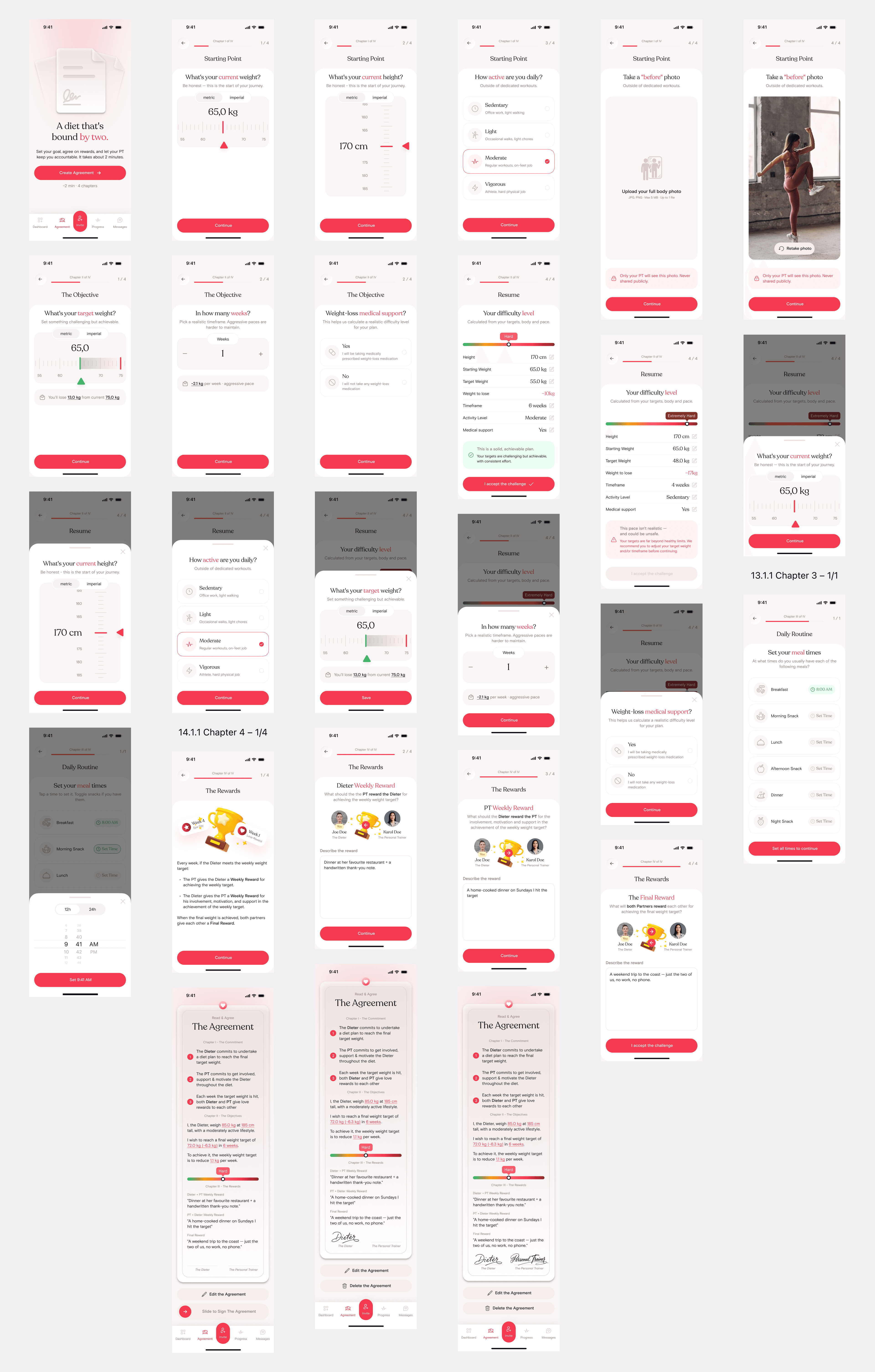
The Agreement as a ritual. Instead of a ten-step form, a Letter of Intent in four chapters — About You, The Goal, The Rules, The Rewards — ending in a single letter written in plain language with both partners' values highlighted. Signing is a slide-to-sign gesture, and a signature block shows three states: both pending, half-signed, both signed.
Progress that reads at a glance. A donut hero for % achieved, a stats trio, a weekly velocity bar chart and a journey timeline. Behavior became a heatmap instead of rows of emoji faces, re-rendering fully on a Meals / Exercise toggle.
Rewards as a trophy case. A collection view with four visual states — won, missed, current, locked — so the whole challenge reads like a set you're completing.
A premium paywall. A dark hero, Lifetime pre-selected with anchor pricing, a zero-scroll layout and a trust row — with Restore Purchases and legal links built in for App Store review.
A new visual language. A serif display face for the emotional moments, a calmer cream-and-raspberry palette, and a two-level token system (primitives → semantic) built in Figma variables.
Note: these concepts are mine and were not shipped — I label them that way on the page.
Outcome
The full product was designed and handed over: both roles, three Agreement entry paths, the Daily Log, every weighing case, Progress, Messenger, Settings, onboarding, sign-up and the paywall — [N]+ screens with their states and edge cases.
The engagement wrapped before launch, and I don't know the current build status — that's a limitation worth naming. What I can say is that the client approved the production design, and the system is complete enough to build from without coming back to design.
Reflections
The most useful thing I did was map the weighing logic as a decision tree before drawing any screens. The reward moments look simple, but they sit on four branches and two edge cases — designing screen by screen would have missed half of them.
The hardest lesson was about scope. I pushed for a more emotional, ritual-like Agreement because I believe that's where this product wins or loses. The founder chose a simpler, more familiar form for launch. That's a fair call for a first version — a familiar pattern ships faster and carries less risk. But if I picked this up again, I'd push to test both versions with real pairs of users early, so the decision rests on what people actually do rather than on my taste or the client's.
Not every idea ships under your hand. The concepts exist, and they're the clearest picture of where I'd take this product next.
© 2026. Made by Andrew Sh