Reach me at:
andrewshpachuk@gmail.com
↗
@lingvo838
↗
↗
Contact
About
Web Express — SaaS CRM & Analytics Dashboard
A full UI redesign of an internal CRM, rebuilt around a clean component system and a calmer, more readable interface.
Role
Product Designer
Client
IQSAY (internal tool)
Year
2024
Timeline
~1 month
Scope
50+ screens · Web · Responsive mobile
Tools
Figma (variables, components, variants)
Overview
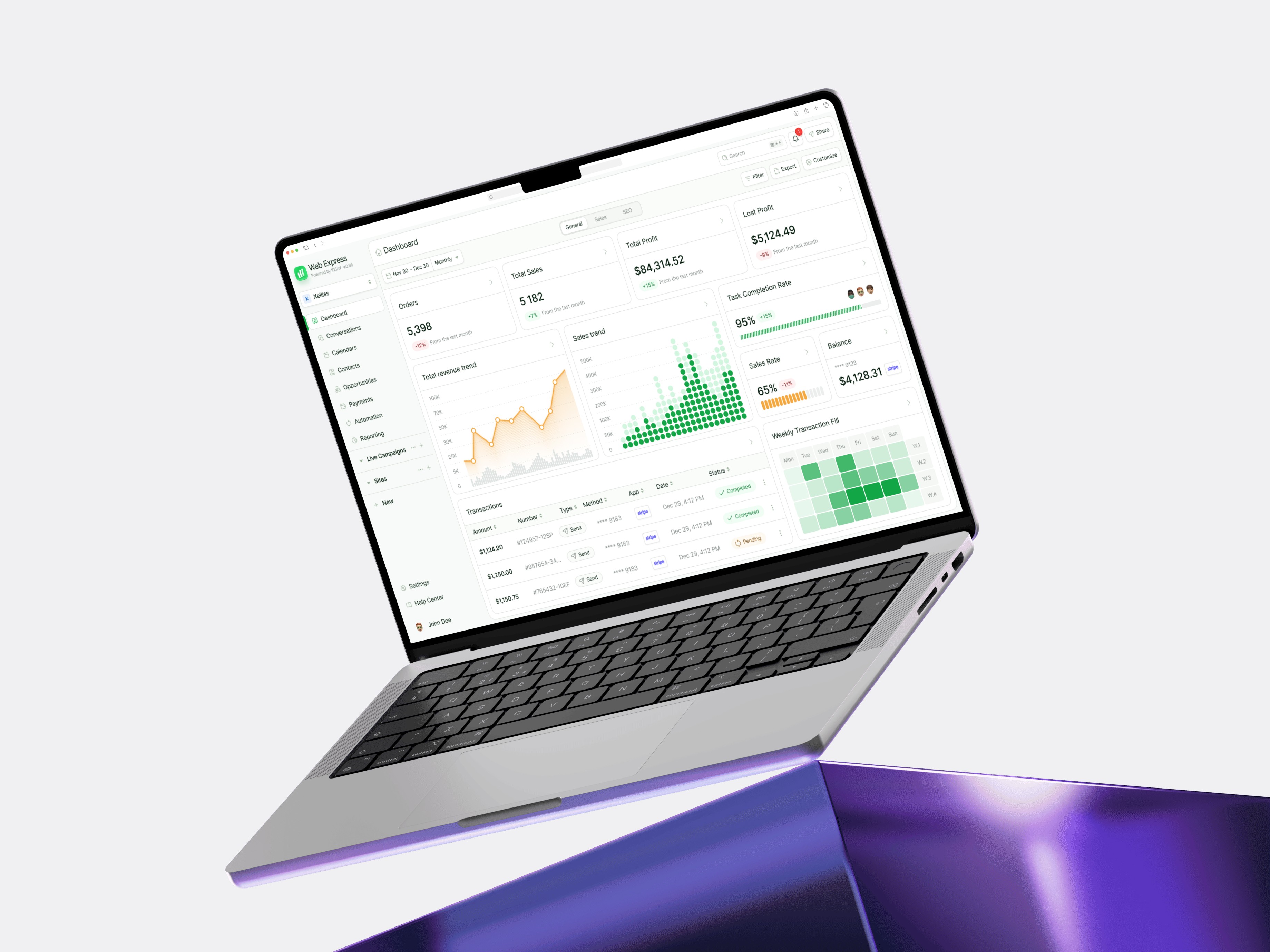
WebExpress is the internal CRM the IQSAY team uses to run day-to-day operations — reports, internal messaging, tasks, settings and more. The product had been around for years but was visibly stuck in the past: a generic admin template, no brand identity, and an interface that the team had learned to use despite its design, not because of it.
I was brought in to fully redesign the UI without changing the underlying functionality. One month, 50+ screens, a complete component system from scratch, and a responsive layer for the screens employees actually use on the go.

The starting point
The existing CRM had three core problems that came up repeatedly when I sat down with the team:
01 — No visual hierarchy. Every element on screen carried roughly the same weight. Headlines, body text, primary actions, secondary actions, metadata — all rendered with the same visual emphasis. Users had to read every screen carefully because nothing guided the eye.
02 — Unclear actions. Buttons didn't communicate priority. Destructive actions sat next to primary ones. Some buttons looked clickable but weren't; some links looked like text. Iconography was inconsistent across modules.
03 — A generic shell with no identity. The product was built on a templated admin theme. Nothing about it felt like IQSAY — the same interface could have belonged to any company in any industry.

Who actually uses this
WebExpress isn't a product on the market. It's a tool the IQSAY team opens every morning and keeps open until the end of the workday. That changes everything about how to approach it.
Before touching any pixels, I sat down with people across different roles to understand how the CRM fits into their day. Three distinct user types emerged:
Managers and team leads. They live in reports. Pulling numbers, comparing performance, sharing summaries with the rest of the company. For them, the CRM is mostly a read-only product — they need to scan, compare and interpret data quickly, often in meetings or while context-switching between tools.
Operations and account staff. They live in tasks and the messenger. Their day is a constant stream of small actions: assigning a task, replying to a colleague, checking the status of a client. For them, the CRM needs to be fast, low-friction and accessible on mobile when they're away from the desk.
Admins and power users. They live in settings and configuration. They don't need a friendly interface — they need a logical one. Settings buried under unclear labels were costing them time every week.
These three groups didn't need three different products. They needed the same product to support three different patterns of attention — quick scanning, fast actions, and deep configuration — without forcing any one group to wade through someone else's complexity.
That insight shaped most of the design decisions on this project: where to invest in density, where to invest in clarity, where to make the mobile layer matter, and what the design system needed to support across the board.
How I approached it
Since the brief was a UI redesign with no functional changes, I treated the project like a focused visual systems exercise: keep the information architecture intact, but rebuild the entire visual language around clarity, hierarchy and consistency.
The process ran in three parallel tracks over the month.
Talking to the team. Within those user groups, three concrete pain points came up consistently — these decided where I'd invest the most design care:
— Reports were unreadable at a glance. Managers exported them to Excel just to get a sense of the numbers.
— The messenger felt buried. It had no presence in the layout, despite being one of the most-used features for ops staff.
— Settings were a maze. Even long-time admins navigated by trial and error.
Building the system before the screens. Instead of designing screen by screen, I started with the foundations — color, type, spacing, radius, shadow — and only moved to UI once the system was solid enough to compose with.
Designing in components from day one. Every element on every screen was built as a Figma component with variants. This meant changes to the system propagated everywhere, and the final library could be handed to engineers as a 1:1 reference for build.

The design system
This is the part of the project I'm most proud of. I built the entire system from scratch — no Material, no Ant, no Tailwind UI as a base. Just a clean foundation made specifically for the kind of work this CRM does.
Tokens and variables
The whole system runs on Figma variables across five layers:
— Color — primary, neutral, semantic (success, warning, danger, info), with full scale ramps for backgrounds, borders and text
— Typography — a tight type scale built around three sizes for body and four for headings, all on the same vertical rhythm
— Spacing — 4-pixel grid, eight spacing tokens that cover 95% of layout decisions
— Radius — four levels, applied consistently across components and surfaces
— Shadow — three elevation levels, used sparingly and only for meaningful surface separation
No dark mode in this version — it wasn't part of the brief, and I made the call not to spec it speculatively. (Adding it later would mostly mean swapping color tokens; the architecture supports it.)


Components
50+ components in the final library, every one with variants for state (default, hover, focus, active, disabled), size where relevant, and content variations. Buttons, inputs, dropdowns, tables, cards, modals, navigation, badges, tags, avatars, empty states, loading states — the full kit needed to compose any CRM screen without having to design from scratch again.


The redesign in practice
I focused the heaviest design work on four modules where the team spent most of their day.
Reports. Restructured around clear hierarchy — the number first, the context second, the breakdown third. Filters became less prominent but more accessible. Tables got proper alignment, monospace numerics, and zebra patterns only where they actually helped scannability.

Messenger. Lifted from a buried tab into a properly designed panel with conversation list, threading, and visible unread states. Same functionality as before — but it now looks and feels like a tool you'd want to use, not one you tolerate.

Settings. Restructured from a flat list of options into grouped, scannable sections with clear labels and inline descriptions for non-obvious settings. The information architecture didn't change — just how it was presented.
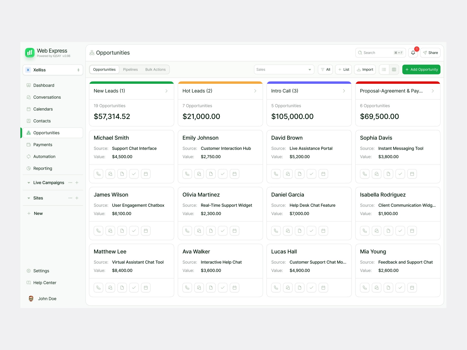
To-do. Tightened density, clearer states for completed vs. pending vs. overdue, better visual separation between assigned, owned and shared tasks.

Responsive mobile
Employees often access the CRM on the go — checking tasks between meetings, replying to messages, glancing at reports — so the redesign had to work on mobile too.
I adapted the key screens (reports, messenger, tasks, settings) rather than redesigning the full product mobile-first. The mobile views collapse navigation into a bottom tab bar, simplify dense tables into stacked cards, and prioritise read-and-respond flows over editing-heavy ones.
Outcome
The redesign was rolled out to the full team and is currently in active use as the company's primary internal CRM.
The qualitative feedback I got from the team:
— The interface became easier to read at a glance. Hierarchy did its job — people stopped having to "study" each screen before acting on it.
— Day-to-day work sped up. Tasks that used to require multiple clicks and squinting became one-step actions.
— The product finally felt like it belonged to the company. Not a generic admin tool anymore.
I built the system to be extendable: new modules and features can be added by composing existing components, without redesigning the foundation. As far as I know, the team is still using and building on it.
Reflections
A month is a tight window for a project this size. If I were doing it again, I'd probably push for two parallel weeks of usability testing on the new system before locking it — we caught most issues through internal review, but I would have liked one more loop with real users.
I'd also lobby earlier for dark mode to be in scope. The architecture supports it cleanly, but speccing it speculatively without a brief felt like overreach. Looking back, even a basic dark variant would have been worth the extra few days.
© 2026. Made by Andrew Sh